
- Computing
Design is how it … looks?
When you purchase through links on our site, we may earn an affiliate commission. Here’s how it works.
 (Image credit: Apple)
- Copy link
- X
- Threads
Sign up for breaking news, reviews, opinion, top tech deals, and more.
Contact me with news and offers from other Future brands Receive email from us on behalf of our trusted partners or sponsors By submitting your information you agree to the Terms & Conditions and Privacy Policy and are aged 16 or over.You are now subscribed
Your newsletter sign-up was successful
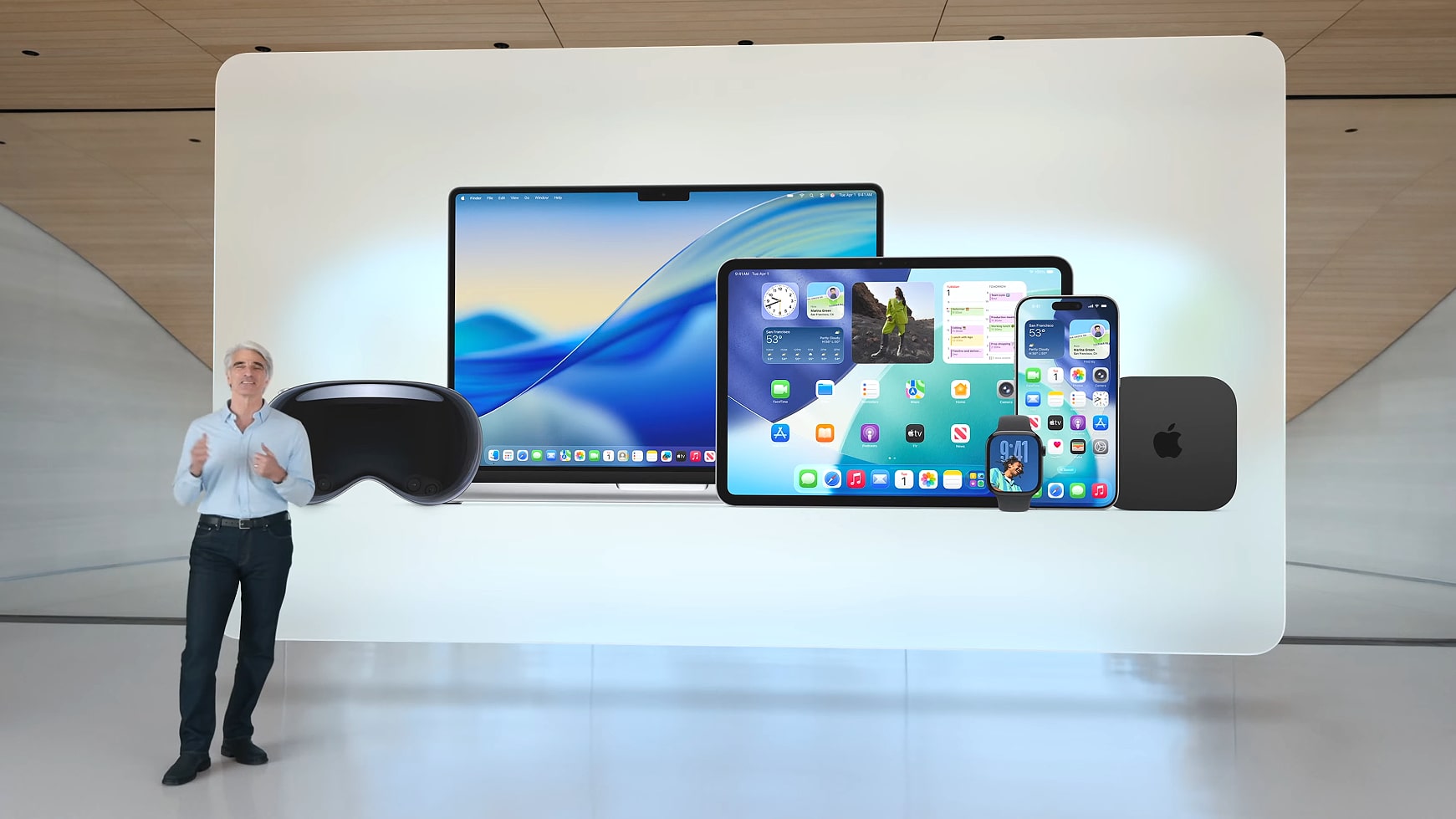
An account already exists for this email address, please log in. Subscribe to our newsletterWhen I first saw macOS 26 unveiled at Apple’s Worldwide Developers Conference (WWDC) in June 2025 – in particular, its new Liquid Glass design language – I'll admit that I was impressed. It looked smooth and visually appealing, and very much unlike anything Apple had ever released. Coupled with one of my favorite default macOS wallpapers in years, it was a sight to behold.
But perhaps more than that, it was a nostalgic invocation of the glassy Aero theme from Windows 7, a design I first experienced in my formative computing years and have had a soft spot for ever since. That connection cemented it in my good books.
You may like-
 Sorry Apple, but I don’t think iOS 26 is fit for purpose
-
 Apple Macs in 2025: the best and worst moments of the year
-
 Ex-engineer argues Microsoft must fix Windows 11 'until it doesn't suck'
Much of the blame has been laid at the feet of Apple’s former design chief Alan Dye, who recently left for pastures new, and I suspect that that’s more or less on the money. But what’s more important is understanding how Apple fixes the malaise and where it goes from here. For a lot of people, including myself, something needs to change.
An epidemic of carelessness
To be clear, the problems I’m talking about are not critical errors, security vulnerabilities, or disastrous crash-causers. They’re not going to burn up your Apple silicon chip or erase your files.
Instead, they’re a subtler kind, but say just as much about Apple as anything I’ve just listed. That’s because they point towards something that has always been anathema to the Apple experience: carelessness.
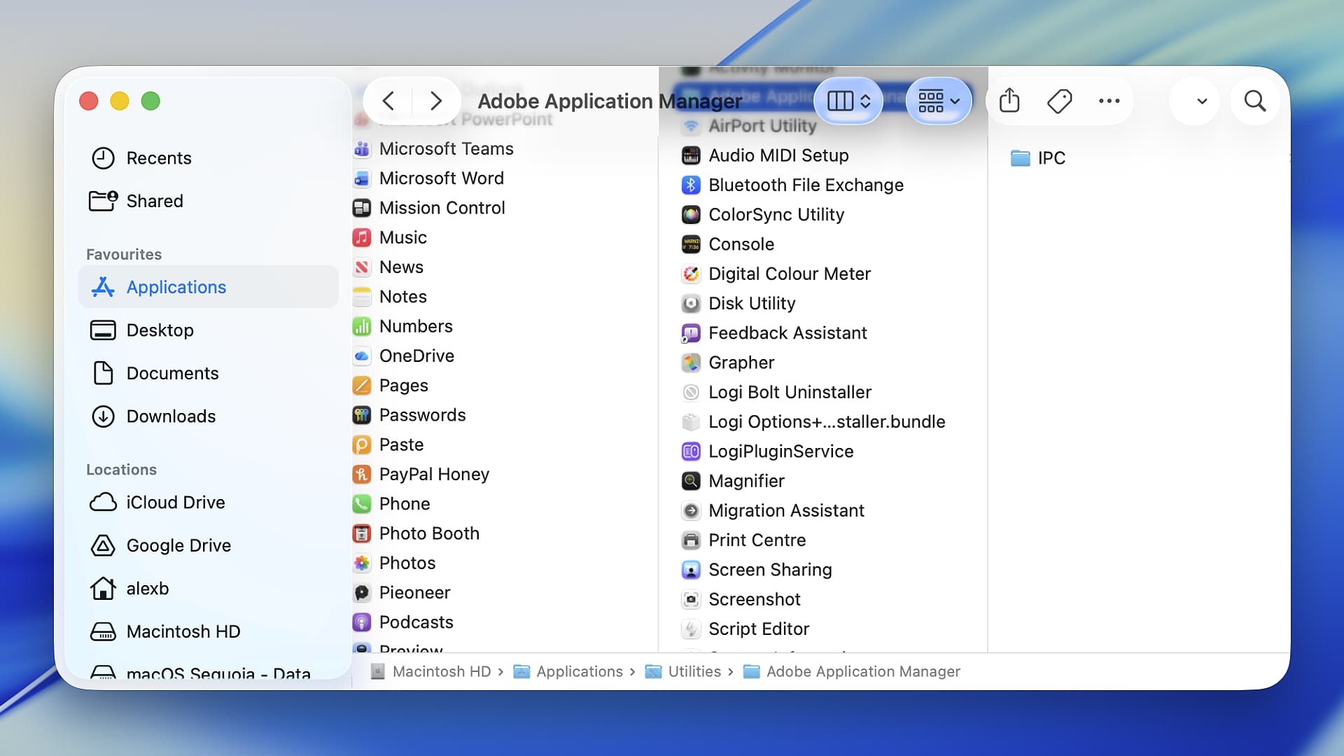
This problem is everywhere you look in macOS 26. For instance, Apple has made window corners more rounded, but completely inconsistently. Compare the rounded corners of the App Store and TextEdit apps, for example – they’re different shapes and sizes.
Get daily insight, inspiration and deals in your inboxContact me with news and offers from other Future brandsReceive email from us on behalf of our trusted partners or sponsorsBy submitting your information you agree to the Terms & Conditions and Privacy Policy and are aged 16 or over.Or try resizing a window from its horizontal or vertical edge; your mouse pointer needs to bump right up against the window before you can grab it. Try it from the corner, and your pointer can grab it from miles outside the window. This directly contradicts the years-old logic that you resize an item by positioning your mouse pointer inside it.
That’s annoying, but there’s a more serious indictment when you realize that Apple often breaks its own design guidelines. Open a menu from the menu bar, and every item will have an icon next to it. Past Apple design guidelines have advised third-party app designers against doing this because it is distracting: the icons clutter the menus. So why has Apple disregarded that good advice in macOS 26?
This kind of situation sends the message that either Apple didn’t put much effort into testing its shiny new operating system – or that it did, but it didn’t care about the slapdash results. And let’s be honest here: neither is a good look.
You may like-
Sorry Apple, but I don’t think iOS 26 is fit for purpose
-
Apple Macs in 2025: the best and worst moments of the year
-
Ex-engineer argues Microsoft must fix Windows 11 'until it doesn't suck'
Through the Liquid Glass
Ironically, Liquid Glass is still one of my favorite parts of macOS 26, despite it coming in for a huge amount of negative press. Yet there are still some aspects of Liquid Glass that I have come to greatly dislike.
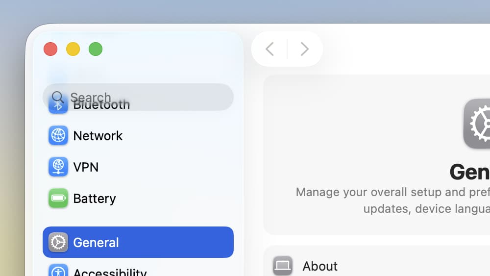
Here’s an example. When you scroll through content, you may notice that it fades out as it reaches the top of the app window. This is not always a problem, but it becomes an issue when that content interferes with controls near the top of the window. Content overlaps and, in bad cases, becomes completely unreadable. Try it for yourself by opening the System Settings app and scrolling the left-hand sidebar. Sidebar items overlap the search box, making text in both elements illegible.
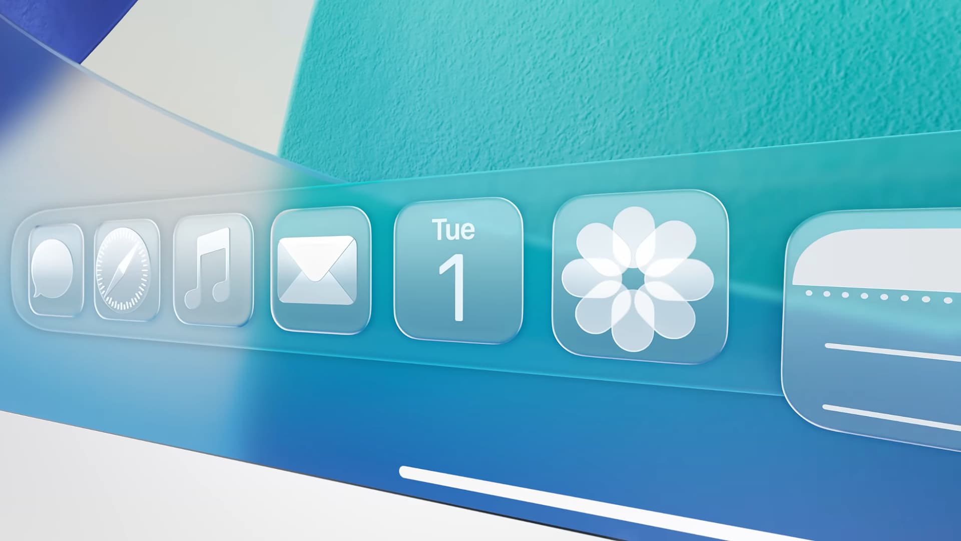
Try looking elsewhere. Enable a settings toggle in System Settings, and it jumps up in the air, distracting your eye and slowing the animation in an indulgent display of overengineering. The clear option for Dock icons, meanwhile, makes them impossible to distinguish from each other. The entire point of an icon is to convey information, even when you just half-glance at it. That they no longer always do this suggests that Apple no longer understands what icons are for.
In so many cases, it seems that the motivation was simply to create something that looked pretty without contemplating anything else. Functionality seems to have been a distant second, if it was even considered at all. This might be expected at some other firms, but it’s happening at Apple of all places. For a company whose entire reputation is founded upon design excellence, this abundant carelessness is deeply worrying.
Why does it matter?
But why, someone might ask, should we care? Isn’t design just about making things look good?
Not according to Apple, it’s not. Steve Jobs himself issued the famous dictum that “design is how it works.” The idea here is that design isn’t just about putting a fresh lick of paint on a terrible product, but instead about making that product work well inside and out. Design must have an integral purpose within the product.
Good design makes software easier to use. Consistency means people know how to use something even if they’ve never touched it before – they’ve gained familiarity by using apps from the same company that work in the same way. It prevents jarring interactions that can worsen the experience.
Yet it seems that Apple under Alan Dye jettisoned the many decades of great design understanding for a system that was founded entirely upon good looks. That’s something I didn’t appreciate when macOS 26 was unveiled to the world. Now that I’ve spent more time with it, it’s plainly obvious that Apple needs to rediscover the design principles that made it so successful in the past.
Follow TechRadar on Google News and add us as a preferred source to get our expert news, reviews, and opinion in your feeds. Make sure to click the Follow button!
And of course you can also follow TechRadar on TikTok for news, reviews, unboxings in video form, and get regular updates from us on WhatsApp too.
Today's best Apple MacBook Pro 14-inch M5 (2025) deals Apple MacBook Pro 14-inch M5 (2025)
 Alex BlakeSocial Links NavigationFreelance Contributor
Alex Blake has been fooling around with computers since the early 1990s, and since that time he's learned a thing or two about tech. No more than two things, though. That's all his brain can hold. As well as TechRadar, Alex writes for iMore, Digital Trends and Creative Bloq, among others. He was previously commissioning editor at MacFormat magazine. That means he mostly covers the world of Apple and its latest products, but also Windows, computer peripherals, mobile apps, and much more beyond. When not writing, you can find him hiking the English countryside and gaming on his PC.
View MoreYou must confirm your public display name before commenting
Please logout and then login again, you will then be prompted to enter your display name.
Logout Read more
Sorry Apple, but I don’t think iOS 26 is fit for purpose
Apple Macs in 2025: the best and worst moments of the year
Ex-engineer argues Microsoft must fix Windows 11 'until it doesn't suck'
5 big problems with Windows 11 that I'm hoping Microsoft fixes in 2026
 'Microslop' is heading for Edge as major redesign is inspired by Copilot
 Microsoft is finally fixing Windows 11 under the hood — but is it too late?
Latest in Computing
Microsoft is finally fixing Windows 11 under the hood — but is it too late?
Latest in Computing
 More Apple Studio Display 2 details are rumored, with two models tipped
 Windows 11's new Start menu is proving seriously divisive
 Quordle hints and answers for Sunday, March 1 (game #1497)
 NYT Strands hints and answers for Sunday, March 1 (game #728)
 Budget laptops advertised with 1.1TB storage could have a huge cloudy catch
 Redditor buys a 32GB DDR5 RAM kit for $300, somehow ends up with 10 of them
Latest in Opinion
Redditor buys a 32GB DDR5 RAM kit for $300, somehow ends up with 10 of them
Latest in Opinion
 Anthropic’s CEO isn’t sure if Claude AI is conscious.
 Trump just banned Anthropic from government use — this is how we got here
 I urge all Radiohead fans to play this weird yet mesmerising PS5 game
 Securing AI infrastructure is critical – here's how to do it
 Five myths about sovereign cloud that could put your business at risk
 As a lifelong Pokémon fan, the return of FireRed and LeafGreen has me feeling hopeful — now I need these 3 classic entries to land on Nintendo Switch and Switch 2
LATEST ARTICLES
As a lifelong Pokémon fan, the return of FireRed and LeafGreen has me feeling hopeful — now I need these 3 classic entries to land on Nintendo Switch and Switch 2
LATEST ARTICLES- 1I was wrong about macOS 26 – its design is far worse than I first thought
- 2Arsenal vs Chelsea Live Streams: How to watch Premier League 2025-26 from anywhere in the world
- 3I tested the slim Honor MagicBook Pro 14 (2026) laptop, and let me tell you, it means serious business with a shockingly long battery life for all-day use
- 4'Makes using fresh coffee beans as simple as pods' — the 3 best coffee makers with grinders, recommended by a barista
- 5Why are so many AI assistants female by default — and should we be worried about that?